Portfolio
Pittsburgh River Hounds/Highmark Stadium
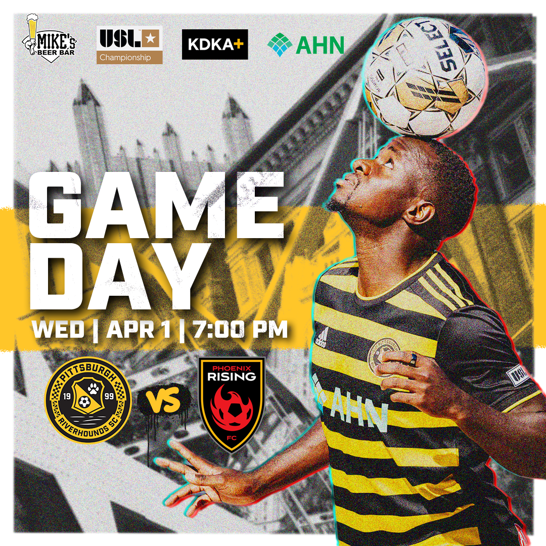
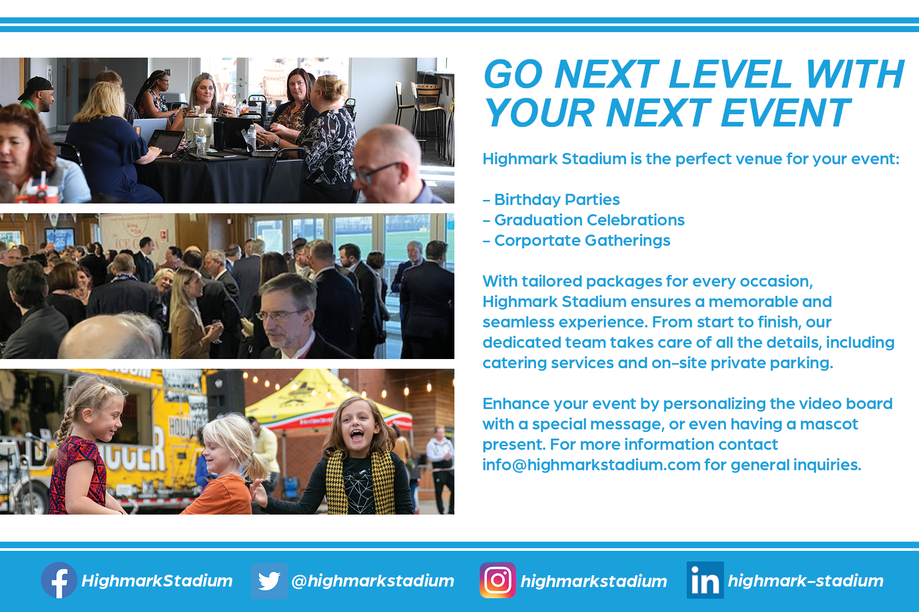
As a graphic designer for the Pittsburgh Riverhounds and Highmark Stadium, I have been instrumental in shaping the visual identity of both the team and the stadium across various platforms. My portfolio includes a diverse array of designs, encompassing both utilized and unused concepts for print, web, television, and social media. With a keen eye for aesthetics and a strategic approach, I have crafted compelling visuals that resonate with the target audience. Whether creating promotional materials, social media graphics, or print collateral, my designs have consistently contributed to the overall branding and marketing efforts of the Pittsburgh Riverhounds and Highmark Stadium, enhancing their presence and creating a visually cohesive and impactful identity.
Smashed Waffles
Below are some examples of print and web work for Smashed Waffles, located in downtown Pittsburgh, PA. The top row shows 4 variations for a marketing flyer to be sent out, and the bottom row includes signs featured in the storefront.
Bottle Flu Brew
This was a branding exercise I created for myself for a start-up brewery. This is an Instagram specific graphic made to spark interest in an upcoming partnership between the fictitious “Bottle Flu Brew” and the Pittsburgh Penguins. These cans would be designed as a full-bleed wrap and would be limited as an “arena only” available item.
The idea for the project came from the illustration used on the beer can. I had created the Sidney Crosby illustration but had never found a good project to utilize it, so I held onto it until I found a project that inspired me to use it. I felt that implementing it as part of a specialty design for a beer can made the most sense. My first step was designing what the average bottle of beer for this company would look like. I pulled a lot of inspiration from Pittsburgh’s history of steel work. In fact, the name “Bottle Flu Brew” is actually a colloquialism used by iron workers for when a co-worker is absent due to a hangover. The colors of the label are a play on the colors of the Steelmark logo, with the actual logo itself consisting of a steel girder. In the background, I decided to go with a construction crane on the left to represent the iron workers, welders, and other construction workers. On the right of the label, I made the choice to go with diamond plate, a commonly found material in most construction sites.
The specialty design started with the Sidney Crosby illustration. I had created this for a prior personal project, but never was able to implement it into a serious design. Once I started this project, it felt like a perfect opportunity to punch up a special Pittsburgh Penguins themed design. The Bottle Flu Brew logo switches to an alternate palette to better blend with the overall can design. The entire background of the can has been designed to replicate the Penguins’ home jersey, and I utilized the yellow outline of the Crosby illustration to reference the iconic Penguins’ logo.
Kolonay Renovations LLC.
This project started as a logo redesign, but evolved into design work for both a vehicle and t-shirt. The client approached me with the interest of creating a new logo that would convey professionalism and the idea of high-end renovation. This process started by researching major remodeling companies (specifically high-end companies) and gathering similar design elements. What I found was most of these logos were either on the minimalist side, or were focused mainly on a wordmark with a bold typeface. After sketching some rough ideas on paper, I sat down an comprised a handful of different variations. I decided to focus on the more sleek, minimalist look for the logos to emphasize the “chic” element of high-end renovation. Concepts 1 and 4 utilized a standard Imperial ruler in the design. My goal was to invoke precision, craftsmanship, and quality. For concepts 2 and 5, I decided to incorporate a “elegant hammer” as the main aspect of the design. This concept was playing with the two opposing ideas of chic construction. Lastly, for concepts 3 and 6 I decided to dig into some of the tools of the trade and looked into various blueprint symbols to see if there was anything I could use for inspiration. I happened to stumble onto the symbol for double doors and thought that would be an excellent element to use.
After speaking with the client, we agreed the lettering appeared too weak and not dominant enough, and that he wanted more of a wordmark. However, the client did like the elements presented and was specifically drawn to concepts 1 and 4 and the ruler element. These were the next concepts I presented him with.
There was a serendipitous moment, while working on these designs, that hit me the instant I finished concept 4. I was especially drawn to the ruler concept, but felt something was off. So I took the increment markings and flipped them to be on the inside of the “K” (as you can see in concept 3). From there, I made a concerted effort to mix this element into a wordmark, similar to some of the logos I had found during my research. After discussing some color options with the client, we landed on an slate sky blue. Below is the finished logo.
Additionally, the client needed a t-shirt design as well as a design for his work pick-up truck. Thankfully, I have experience in both. As you can see from my résumé I’ve had years of experience in layout and designing t-shirts. Not listed on my résumé is that my father has been designing, striping, and detailing emergency vehicles for over 30 years, and I was his main assistant growing up. It’s a huge part of what has shaped me as a designer and a part of me that I will always cherish. So I was familiar on how to properly prep and layout the designs. Below are the finished products of both the truck and t-shirt.
My BFF Social
These are a series of pieces I completed for a social media consulting agency named My BFF Social. Each of these pieces were done in conjunction with a brand ambassador to meet copyright guidelines and marketing objective. Below are examples of the work I produced for one of My BFF Social’s larger clients, Kinect Energy. Most of these projects were designed as direct mail pieces, with the exception being the last piece which was designed as a LinkedIn header.
The following projects were for another client, Freedom Mortgage. In this campaign, they were aiming for social likes and casual content to help bolster their presence on Facebook, Twitter, and Instagram.
Center for Young Musicians
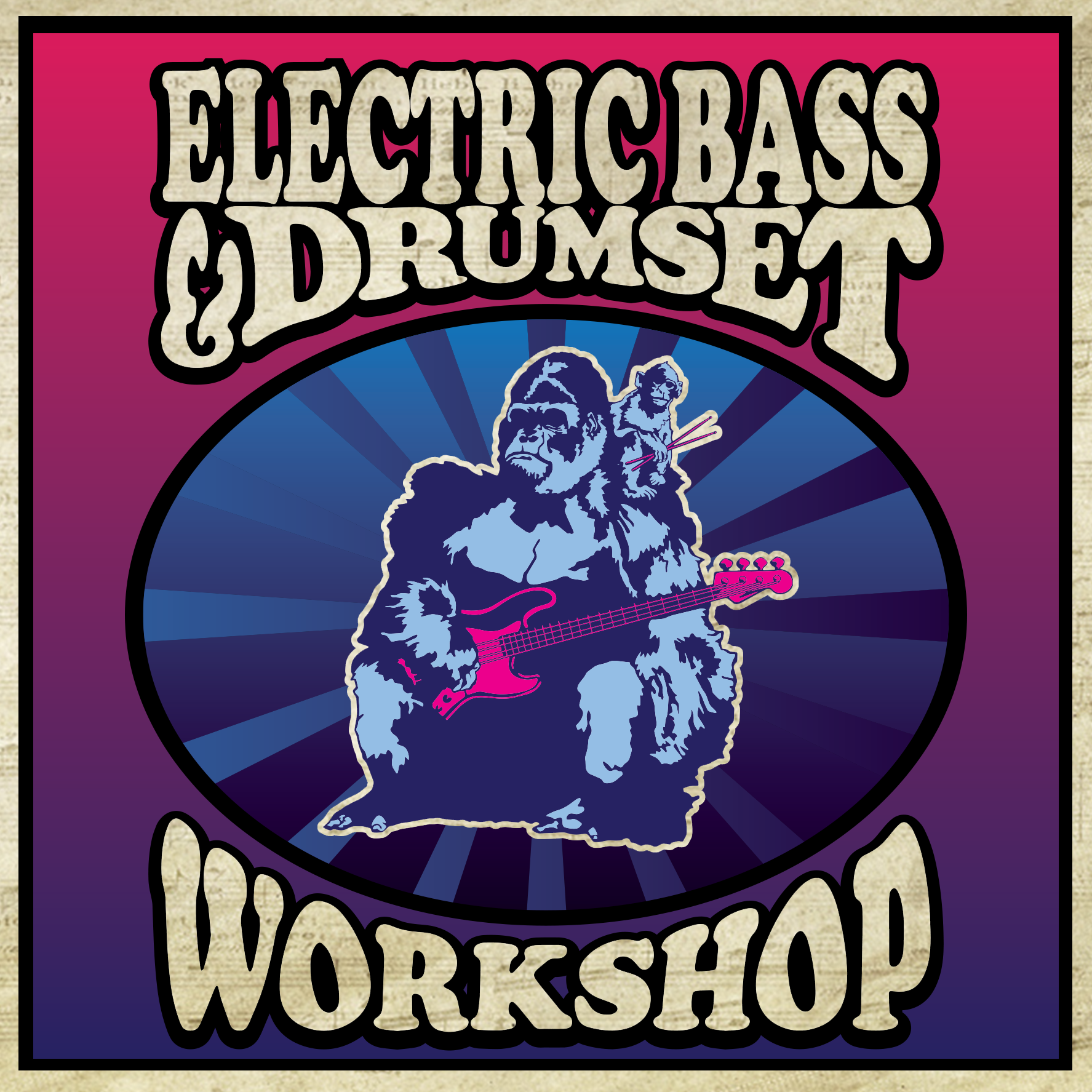
Part of my responsibilities at the Center for Young Musicians is to design and implement various artwork for internal and external use. This means designing graphics for online and print. The direction presented by my employer was to embrace bright, colorful imagery to convey the sort of energy and vibrancy that music brings. Below are pieces that have a more targeted aspect: these were social media designs that were also implemented as imaging for our website as well. For most of these graphics, I chose a 1:1 square ratio (1080 x 1080) as I’ve found it’s one of the more acceptable formats across social media (although I acknowledge it is not exactly a recommended format for some social channels). These designs, while still important, needed to be done with expediency, and most of these were created and finishing within a day.
This next group contains print oriented designs. These were designed in conjunction with the Pittsburgh Symphony Orchestra, Pittsburgh Parent Magazine, and flyers for our own personal use. The horizontal images are specifically advertisements for playbills, programs, etc, while the lone square image was an ad for Pittsburgh Parent Magazine. The vertical images were all made as flyers to garner attention from the current students or the occasional passersby.
Steel City Shockwave
Hockey is a particular passion for myself, so I jumped at the opportunity to design a hockey logo. From the start, I aimed to design a classic feeling logo. I wanted it to feel as though it wouldn't feel out of place compared to modern and classic sports logos. Included in this gallery is a variation sheet I sent to the client.
Valiant 3 Communications
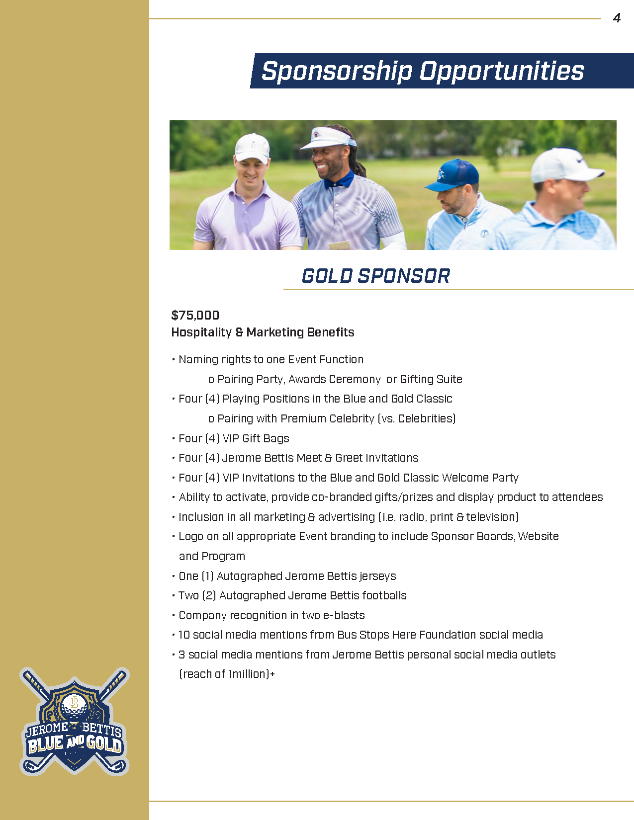
Below are some of the projects I have completed for Valiant 3 Communications, who have such clients as Jerome Bettis, the estate of Bruno Sammartino, and more. First is a sponsorship packet I created for Jerome Bettis’ Blue and Gold Classic. Below is a portion of the complete packet.
Next, is another sponsorship packet designed again for Mr. Bettis for Jerome Bettis Bus Stops Here Foundation “Par-Tee" 36 Golf outing. This included generating a logo concept as well as the actual packet itself. Below is part of the complete sponsorship packet.
Last, is a sponsorship packet designed for Century Soccer. This was completed by using assets provided by the client while also adjusting and creating vector assets of flattened images. Below is a portion of the complete packet.
Premier Promotional Solutions Social Media Designs
This is a collection of various graphics designed for social media. While most of these differ in styles, I wanted to create something eye-catching and vibrant. I purposely felt that designing each ad in its own unique style would prevent stagnation and would grab viewers attention.
Pittsburgh Sports Comic Covers
This is an ongoing series of designs based around two of my greatest passions: comic books and sports. I wanted to parody famous comic covers by using news within the Pittsburgh professional sporting community. These were originally designed to be a part of a bi-monthly feature on a sporting blog. (There is one exception piece which is the FC Dallas cover).
Fire Breather Hot Sauce
For this project, I was tasked with creating a branding for a small hot sauce company. I drew a lot of inspiration from ancient Celtic and Norse designs depicting dragons and fire. One of the more difficult aspects was ensuring the overall design kept some modern flair.


![Poster Final Preview PNG [No Bleed]-01.png](https://images.squarespace-cdn.com/content/v1/52cb2d5fe4b0935349f71864/1589941597849-8IC0G0F13XVN8PJ193W0/Poster+Final+Preview+PNG+%5BNo+Bleed%5D-01.png)


